| filebase | forums | discord | server | github | wiki | web |
| cubebot | epodbot | fritzbot | gravebot | grogbot | hpbbot | ivpbot | jkbotti | joebot |
| meanmod | podbotmm | racc | rcbot | realbot | sandbot | shrikebot | soulfathermaps | yapb |


Re: Work on Wesite? |

|

|
(#141)
|
|
Member

Status: Offline
Posts: 270
Join Date: Jun 2004
Location: Nottingham, UK
|
News links: rather than asking to click here, let them click anywhere in the box.
as for the background thing: if you go to the about page, and scroll so one line of text is broken in half acros the top of the frame, you'll see that the top of the letters overlap into the darker blue bit. I made the suggestion before actually looking at your source. Theres two ways of fixing the problem: move the colour out of the main iframe, or increase the borders on it. Another problem I've found is that if you increase text size to max, the nav bar text overlaps the right hand sind of the graphic. |
|
|

|
Re: Work on Wesite? |
|
|
|
(#142)
|
|
Member
Status: Offline
Posts: 270
Join Date: Jun 2004
Location: Nottingham, UK
|
also, add a input with type=hidden name=pack to the waypoint pages, so you only need one php page to rate the pointpacks.
|
|
|
|
Re: Work on Wesite? |
|
|
|
(#143)
|
|
Moderator by day Waypointer by night

Status: Offline
Posts: 1,039
Join Date: Apr 2004
Location: Missouri
|
i would add that stuff but i already have it like it is lol... and the only real way to fix the text problem is to change the size of the frame which i am not going to do.... and besides it isn't that big of a deal and i will do that link for the new thing
|
|
|
|
Re: Work on Wesite? |
|
|
|
(#144)
|
|
Member

Status: Offline
Posts: 16
Join Date: Mar 2004
|
new waypoints found for my site
 @+ |
|
|
|

Re: Work on Wesite? |
|
|
|
(#145)
|
|
Moderator by day Waypointer by night
Status: Offline
Posts: 1,039
Join Date: Apr 2004
Location: Missouri
|
well i think we are ready to be link on the forum... well IMO i think we should
|
|
|
|
Re: Work on Wesite? |
|
|
|
(#146)
|
|
Member

Status: Offline
Posts: 512
Join Date: Feb 2004
Location: STL MO USA
|
Nothing shows up for me in that top bar!
Is there supposed to be a logo up there or something? 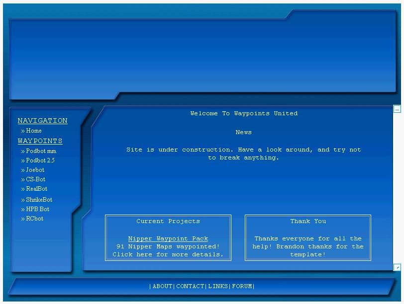 |
|
|
|
Re: Work on Wesite? |
|
|
|
(#147)
|
|
Moderator by day Waypointer by night
Status: Offline
Posts: 1,039
Join Date: Apr 2004
Location: Missouri
|
i don't have a graphic to put there yet....
 ... are you anygood with photoshop ... are you anygood with photoshop |
|
|
|
Re: Work on Wesite? |
|
|
|
(#148)
|
|
|
Member
Status: Offline
Posts: 512
Join Date: Feb 2004
Location: STL MO USA
|
Quote:
|
|
|
|
|
Re: Work on Wesite? |
|
|
|
(#149)
|
|
Moderator by day Waypointer by night
Status: Offline
Posts: 1,039
Join Date: Apr 2004
Location: Missouri
|
i dissagree but... i think the site should be linked now... people are coming to get waypoints not look at the banner... we will have one we just don't yet
|
|
|
|
Re: Work on Wesite? |
|
|
|
(#150)
|
|
|
Member
Status: Offline
Posts: 512
Join Date: Feb 2004
Location: STL MO USA
|
Quote:
I say go for it! |
|
|
|
|
 |
«
Previous Thread
|
Next Thread
»
| Currently Active Users Viewing This Thread: 1 (0 members and 1 guests) | |
|
|

Powered by vBulletin® Version 3.8.2
Copyright ©2000 - 2025, Jelsoft Enterprises Ltd.
vBulletin Skin developed by: vBStyles.com
Copyright ©2000 - 2025, Jelsoft Enterprises Ltd.
vBulletin Skin developed by: vBStyles.com