 |
| filebase | forums | discord | server | github | wiki | web |
| cubebot | epodbot | fritzbot | gravebot | grogbot | hpbbot | ivpbot | jkbotti | joebot |
| meanmod | podbotmm | racc | rcbot | realbot | sandbot | shrikebot | soulfathermaps | yapb |
Some screenshots from me. |

|
|
(#1)
|
|
|
Project Leader, Lead Level Designer, Waypointer
Status: Offline
Posts: 337
Join Date: Mar 2004
Location: Denmark
|
Sow_Entombed - Started ~10 months ago
Max w_poly is 700, but usually around 300-550.        Sow_Hangar - Started ~5 months ago Max w_poly is 600, but usually around 300-450.        Sow_Khefren - Started yesterday, first compile therefore the brightness needs to be adjusted. Max w_poly is 125  |
|
|

|
Re: Some screenshots from me. |

|
|
(#2)
|
|
|
Moderator [PBmm/Waypointing]& PODBot mm waypointer
Status: Offline
Posts: 1,492
Join Date: Feb 2004
Location: C.C.A.A., Germania
|
Wow, Sow_entombed looks impressive... especially those camel & horse models. Did you make them yourself? But also the rest of the map... great stuff! Now if only I knew what "sow" stands for...? (Excuse my ignorance)
Just a few tiny things: In the 2nd screen, that long wall looks a bit "cut off" on top, and in the 5th screen, that building with the round window / ornament looks too two-dimensional... it's quite visible that it's just a wall and nothing behind. However, I doubt if these details will be noticeable in game. Btw, I like the name "entombed", hehe... Sow_hangar - is the outside area finished? It could use some details to spice it up a little. The village, however, looks pretty damn awesome! What's with that cable sprite (is it a sprite?) in the 2nd screenie... it looks like a section is cut off & missing? Just a minor glitch, though. And what's that sniper rifle? That must be one of the ugliest weapon models I have ever seen. It looks totally unskinned, and the scope mount is blockier than a Borg spaceship... Well, the khefren screenie is really too dark to reveal much...  but if it's up to the standard of the other two, it must be good! but if it's up to the standard of the other two, it must be good! Roses are #FF0000, violets are #0000FF // all my base, are belong to you. |
|
|

|
Re: Some screenshots from me. |

|
|
(#3)
|
|
|
Roi de France
Status: Offline
Posts: 5,049
Join Date: Nov 2003
Location: 46°43'60N 0°43'0W 0.187A
|
I really like your way to map interior environments, Zacker. It looks awesome and VERY credible. Strictly nothing to say.
 However I'm less a fan of the way you map outdoors... I don't know... it's the style. No offense... Somehow I think it misses notions of architecture. If I had the time to I'd edit and annotate your pics with mspaint and circle in red the parts that I believe need a bit of work. Maybe I'll do that... but later  But as I said the indoors is really neat  RACC home - Bots-United: beer, babies & bots (especially the latter) "Learn to think by yourself, else others will do it for you." |
|
|

|
Re: Some screenshots from me. |

|
|
(#4)
|
|
|
Member
Status: Offline
Posts: 102
Join Date: Apr 2004
|
solid brush work man!
the only thing i kinda noticed was that in pic #6 some rock textures looked kinda stretched... but aside from that little thing nice work dude keep on mapping  |
|
|

|
Re: Some screenshots from me. |

|
|
(#5)
|
|||||
|
Project Leader, Lead Level Designer, Waypointer
Status: Offline
Posts: 337
Join Date: Mar 2004
Location: Denmark
|
Thanks for the comments.
SoW is short for Sands-of-War, a HL mod I am leading. I cant take credit for any of the models, nor the textures. Quote:
Quote:
Quote:
Quote:
The sniper rifle model is ok, but the skin is far from decent, we know that  We dont have many good skinners on the SoW team. We dont have many good skinners on the SoW team. |
||||
|
|

|
Re: Some screenshots from me. |

|
|
(#6)
|
|
|
Moderator
Status: Offline
Posts: 860
Join Date: Mar 2004
|
compared to your famous Prixun.........this shit rocks!
so.....i agree on the outside areas but for one main reason: the ground work is too "pointy"...hard example is the fourth pic down on Hangar but it all looks alright man, you have definately left mapper-n00bdom behind you  keep it up keep it up |
|
|

|
Re: Some screenshots from me. |

|
|
(#7)
|
|||||
|
Moderator [PBmm/Waypointing]& PODBot mm waypointer
Status: Offline
Posts: 1,492
Join Date: Feb 2004
Location: C.C.A.A., Germania
|
Quote:
Quote:
Quote:
Quote:
 Roses are #FF0000, violets are #0000FF // all my base, are belong to you. |
||||
|
|

|
Re: Some screenshots from me. |

|
|
(#8)
|
|
|
Roi de France
Status: Offline
Posts: 5,049
Join Date: Nov 2003
Location: 46°43'60N 0°43'0W 0.187A
|
Here are my few $.02 over these screenshots, for what they're worth
 Like I said most of them deal with exterior issues. I have little to say about the interior, it's almost perfect. 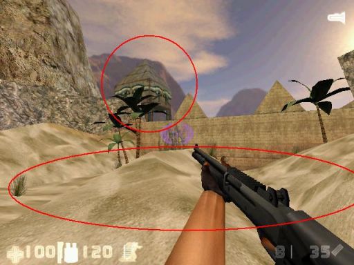 The tower on the left has eyes painted on it that may be here to recall the architecturial style of aztec/maya constructions. If this is the case, there's a double impossibility. First because all the precolumbian architecture is made of cementless walls of large blocks of stone, which weight a lot. It is impossible to have them in such a tower where the 4 pillars would be utterly insufficient to support the weight. Second because this type of tower simply does not exist in precolumbian architecture. The exact same thing applies for middle-east architecture in case I understood wrong. That very dodgy ground indicates a strong influence of winds to move sands around in dunes. In this case it is impossible for a palm to stand in such an environment. Palms are found in oasises only, and/or on solid ground. Never on sand. 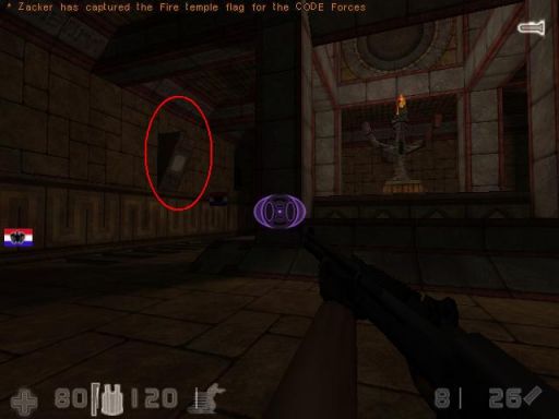 That type of canopy always supports a candle or a brasero. It has no other use in ancient architecture. Eventually for a shelf, or supporting a statue, but in this case it would be much closer to the ground. 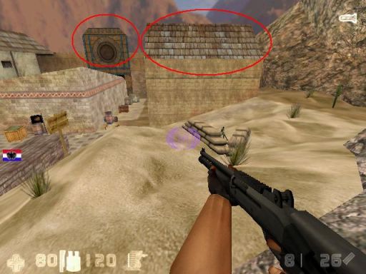 That big structure in the background looks 2D somehow... And these sort of roofs are an absolute impossibility as well. Bent roofs have only one purpose: it is to allow the rain to evacuate quickly, and the most bent ones are so that the weight of the snow deploys on the whole construction. You only find these types of roofs in mountain environments where the winters are cold and icy. Even in temperate environments (west europe for example) the roofs are not that bent. But in sunny and warm (tropical and equatorial) environments, all roofs are FLAT. Always. They also often support a platform where people can stand on evenings when the sun is not high in the sky. They don't need to be bent because the precipitations (rain and snow) are almost inexistent and would they fall they wouldn't be a problem for the stability of the building. In cold mountains on the other hand, the weight of the snow on top of the roofs can average the ton, it is there MANDATORY for the roofs to be bent to ease the evacuation and dispatch the weight better over the building structures. And where there is sand there can't be snow. What you have here is an impossibility. 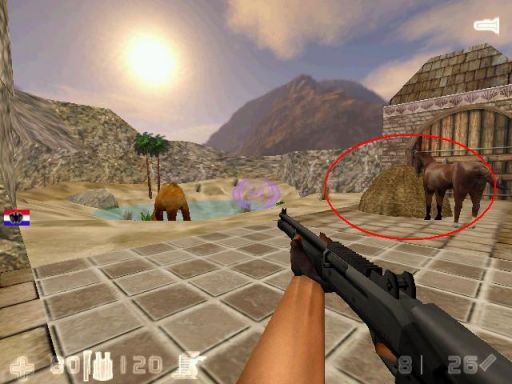 Who transported this pile of grass here ? The farmer who did this must be very stupid: it's on an exterior platform very exposed to wind ; he can be sure that by tomorrow nothing will remain of his nice pile  In farms these sort of piles are stocked either against a wall, or better in a corner, and almost always indoors. When it is stocked outdoors, it is for drying the grass (hence not suitable for feeding animals) in the middle of a yard surrounded by walls so that the wind has little effect on the pile. But as is, it's unrealistic. 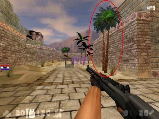 An advice to mappers: never put trees that close to walls. In real life you hardly ever find trees that are close to buildings. The reason is simple: the roots of the tree always explode the walls with time while growing. Come back 10 years later and there is a large crack in your wall. Come back 20 years later and the wall is down.  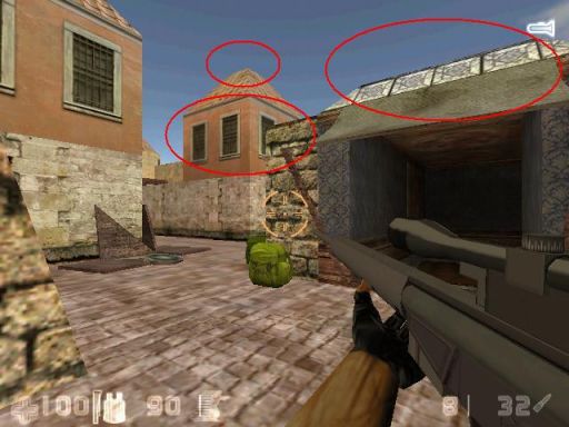 Same remark about the roof as before: if this map takes place in a warm (tropical or equatorial) environment, roofs CANNOT be bent but flat. Simple. On the other hand, if this map takes place in a temperate environment, then why is the top of the roof flat while the most of it is bent ? How can the rain flow down at the top ? I circled in second the texture that is on top of the entrance. What sort of texture is this ? It looks like ceramic. Why put ceramic here ? Now there's also something about the windows: they are WAY too close to each other. Plus there seems to be windows on 4 sides of the building, which makes us 8 windows for a... 20m² room !!! I mean, wtf ? There's nothing like this in real life  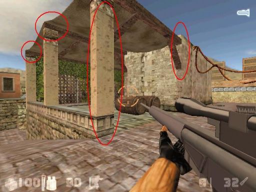 There are structural oddities here. First, the pillars are not wide enough. They oughta be of square section at least (its structure is way too weak elseway). Then, the wooden beams just cannot be standing on top of the pillars but have to be carved inside. It's way too weak too. Any shock, or even the erodion combined with the wind and precipitations, can make the beam fall in a few years time. There is also an oddity where the beam just touches a convex corner at 90°. It just looks like as if the beam was "pasted" there with some miraculous glu. Nope: in all architecture walls are hollowed to support wood structures. 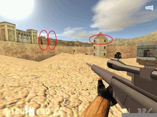 What's the purpose of these structures in triangle on the left ? The only thing I could see would be if it was for a temple, and where they would have a spiritual meaning. But they are not evenly placed, not symetrical to anything, and as far as I can see the wall that supports them has no decoration, no painting, just a plain dull wall. If these structures are part of a temple or something of spiritual interest, insist on the decoration nearby (sculptures, statues, etc.) Also, there is a lack of space at the top of the tower between the window and the roof. Yet another note about these roofs: if you REALLY want to make bent roofs, don't forget their purpose: it is to evacuate rain. Hence these roofs must ALWAYS overlap the wall a bit (so that the rain cannot flow against the wall and make it dirty). 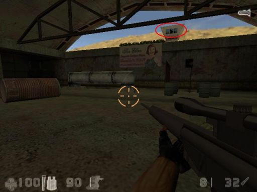 The purpose of such towers in "Y" is to provide a large field of view to the observator inside thanks to a wide glass bay. All these towers are completely circled with glass windows, on all their width. I don't see the point of the "Y" structure with the windows you have. 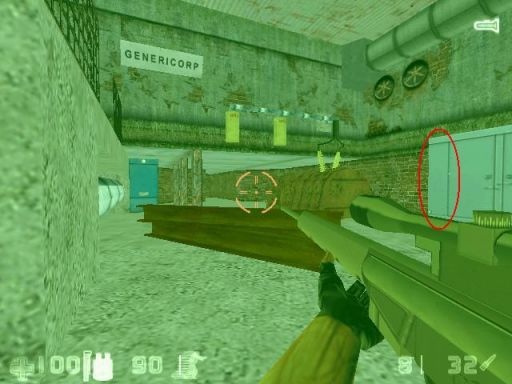 A texture problem here ? My apologies if not  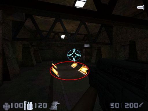 IMO the orange background color around the neon tubes doesn't fit here... that's all I can think of so far. Good work on all the rest, especially the interior. RACC home - Bots-United: beer, babies & bots (especially the latter) "Learn to think by yourself, else others will do it for you." |
|
|

|
Re: Some screenshots from me. |

|
|
(#9)
|
||||||||||||||||||||
|
Project Leader, Lead Level Designer, Waypointer
Status: Offline
Posts: 337
Join Date: Mar 2004
Location: Denmark
|
Better late than never, sorry for the delay.
Quote:
 The gameplay is about controlling points in the maps. Each map has 4-6 flags which you need to capture all of in order to get any points. The gameplay is about controlling points in the maps. Each map has 4-6 flags which you need to capture all of in order to get any points.Overall the mod is far from unique. If you know CS, HL, ToD, DoD, Q3, UT or any other fps you will feel comfortable. Quote:
Quote:
 Prrrhrhhr PMB, that will take me hours to reply to, thanks! Quote:
Quote:
Its long time ago, so the ladder is gone  Quote:
Quote:
Quote:
 Bent roofs are primary used to prevent the rain from going in the houses here. Rooms beneath flat roofs are really hard to keep dry. My dad is a carpenter  Quote:
Quote:
 Quote:
 Quote:
 Honestly, I have no idea besides they wanted it to look nice. Honestly, I have no idea besides they wanted it to look nice.Quote:
Quote:
Quote:
Quote:
 Quote:
Thanks for the comments! |
|||||||||||||||||||
|
|

|
 |
«
Previous Thread
|
Next Thread
»
| Currently Active Users Viewing This Thread: 1 (0 members and 1 guests) | |
|
|
Powered by vBulletin® Version 3.8.2
Copyright ©2000 - 2025, Jelsoft Enterprises Ltd.
vBulletin Skin developed by: vBStyles.com
Copyright ©2000 - 2025, Jelsoft Enterprises Ltd.
vBulletin Skin developed by: vBStyles.com


