 |
| filebase | forums | discord | server | github | wiki | web |
| cubebot | epodbot | fritzbot | gravebot | grogbot | hpbbot | ivpbot | jkbotti | joebot |
| meanmod | podbotmm | racc | rcbot | realbot | sandbot | shrikebot | soulfathermaps | yapb |
Re: What's Carp Got Cooking ? |

|
|
(#71)
|
|
|
Moderator
Status: Offline
Posts: 860
Join Date: Mar 2004
|
i hate the compile waiting to
 this damn jump map is running close to an hour for a compile....thats 20 minutes longer than any other map ive made so far..... i think i agree with the leaves thing PMB said |
|
|

|
Re: What's Carp Got Cooking ? |

|
|
(#72)
|
|
|
Member
Status: Offline
Posts: 182
Join Date: Apr 2004
Location: The Great White North
|
test version is ready
check your PM box PMB heh ... that sounds funny   |
|
|

|
Re: What's Carp Got Cooking ? |

|
|
(#73)
|
||
|
Moderator by day Waypointer by night
Status: Offline
Posts: 1,039
Join Date: Apr 2004
Location: Missouri
|
Quote:
|
|
|
|

|
Re: What's Carp Got Cooking ? |

|
|
(#74)
|
|
|
Roi de France
Status: Offline
Posts: 5,049
Join Date: Nov 2003
Location: 46°43'60N 0°43'0W 0.187A
|
A lil feedback, Carp ? here goes. *ahem*
 Whoa. First off, let me congratulate you because this map is of superb quality. In all aspects. There are not many things to say. And the most of what I have to say deals about so ridiculous details that I'm almost hesitating to point them out. Let's go'n have the usual screenshot tour, now: 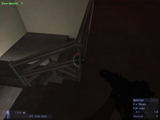 This is the ONLY tidbit of a quarter of the half of a texture problem that I could find in the entire map after nearly 1 hour wandering everywhere! And even, it's not really a texture problem since it rather looks like a lighting issue. I'm talking here about the rail but also the wall in the back, which shades in different tones, giving a weird look. I'm not sure what you can do about it if it's just the way the map is compiled. Everything elsewhere, everywhere, is PERFECT, up to the classrooms being numbered in the right order and according to their floor. Ku-dos! One detail though: 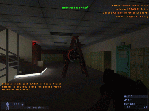 I'm willing to give 100 bucks to the guy who tells me he's able to deploy the same ladder in real life. Think about it : once it's folded, the ladder is taller than the ceiling  Now about the eventual changes to the layout, well: 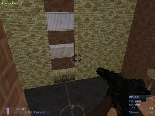 if I understand right, this is the entrance yard to the school ? I'm thinking it would be problematic for pupils and visitors to enter and leave the school when other pupils are having a basketball match. I don't see them crossing the field. A good architect would have put at least a sidewalk around it, in the same tones (grass + tiles) as the central yard. Just enlarging the yard and make a sidewalk with benches and eventually a few potted plants in the corners would be more appealing and would feel more logical to visitors. Another thing here, about the gameplay: when you enter this yard, there is ONLY one way out (i.e, the door). This is something to avoid at all costs in a deathmatch map (and in any sort of map in general anyway). You can be sure elseway that nobody will ever put a foot there. Ensure all places have at least 2 ways in/out. You could here, for example, make a little door in a corner leading to an administrative office or something, which itself would lead directly into one of the corridors of the first floor of the school. Another thing: what's this rotty wooden door ? Is that a modern school's entrance door ? No way dude, change me that please  It rather looks like a haunted manor's door as is. Why not make a large automatic sliding door in transparent plexiglas like those there are in supermarkets and public buildings in general ? And for the main entrance from the street, a bright sas (with the door to the street unopenable of course) would be a nice addition. You must have already seen one of these stupid $2 movies for teenagers that take place in californian schools. Just imitate It rather looks like a haunted manor's door as is. Why not make a large automatic sliding door in transparent plexiglas like those there are in supermarkets and public buildings in general ? And for the main entrance from the street, a bright sas (with the door to the street unopenable of course) would be a nice addition. You must have already seen one of these stupid $2 movies for teenagers that take place in californian schools. Just imitate  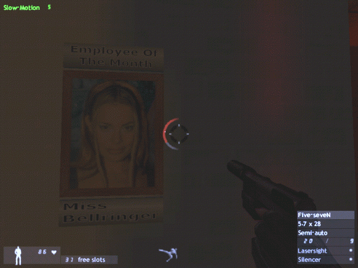  MAO! Intoxicated, eh ? MAO! Intoxicated, eh ?  but hell yeah, that chick is well worth such an obsession  That corridor is really dark though. It's a very good thing as is but what is not is that you often bump into short obstacles such as benches or potted plants (hm, can't remember if there were potted plants there.... but there were obstacles anyway). 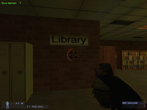 There's something that doesn't fit here... I think it's the font. It's not the same font as the classroom numbers, am I right ? Try taking a more "official" font such as those you see on public signs. Aaah, the library. I DO HAVE something important to say about this library dude. NOBODY ever will get his feet in it if it stays as is. Because it's on an end of the building, and there are only 2 ways to get there: one from each side of the first floor. Not only you can't open the door to the yard, but you can't even SEE outside. This library has strictly no tactical interest, which is a shame since it's the most appealing part of the map. What's the point of climbing the stairs and get to the upper floor ? Nothing to ambush there, nothing to do but to collect 2 miserable powerups. That's not where the action happens. By all means, by all means, make the door to the yard opens, and make the 2 windows breakable, arrange them, widen them so that a sniper could at least climb up the shelves on the upper floor and snipe outside. Or do something, but make people come and go in your library. The middle yard, on the other hand... 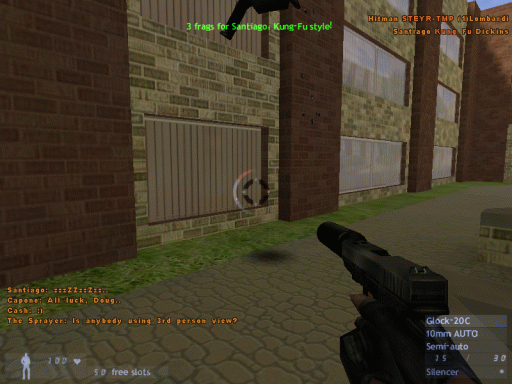 ...is where most or all the action takes place. If there are less than 16 players in your map, people get lonely very fast searching for each other and fatally meet in the middle yard. But from 24 to 32 players, it's an AWESOME map! Only constant though: the middle yard is THE attraction point. So by all means too, to even the dispersion of players through the whole map, make the doors open !!! Currently there are 6 ways to enter this yard (the 6 breakable windows) and only 2 to leave it (the 2 windows from the first floor). And that's where the problem is. 4 are one-way, 2 are bidirectional. That's where all the action will take place : through these windows. So, by deduction, first thing to do: make these damn curtains drawable  I can't bear getting headshot by bots through these curtains. Make them work just like the curtains in cs_747. Next thing to do in this yard, most important : I can't bear getting headshot by bots through these curtains. Make them work just like the curtains in cs_747. Next thing to do in this yard, most important :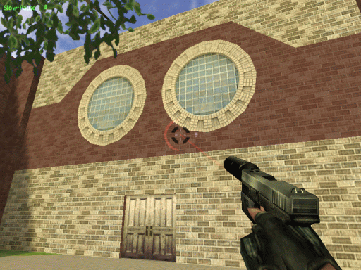 make EXITS. Make the door to the library OPEN, make two other doors by the other end open too. That will perfectly even the ins and outs. People will be able to LEAVE the yard without crossing that lethal window-to-window killer range. Anyway, congratulations on the new leaves... 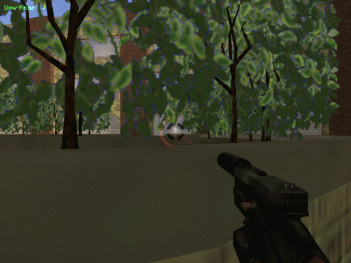 ...and the height at which you put the bushes. That's simply perfect. Oh, by the way, did you know ? 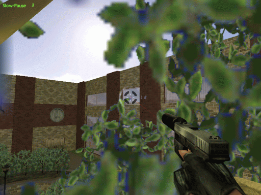 Your tree is climbable. Well, it is, but only if you pick up the matrix-jump powerup. Since there are such powerups here and there in the map it's quite common to find one in a round. It's a perfect sniping spot! and as you can see... 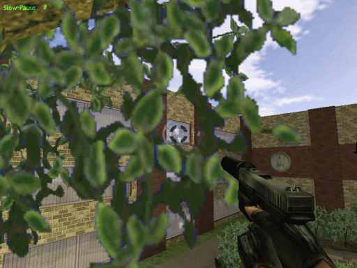 ... it can cover the 2 sides of the yard. The only problem, is that climbing up there requires a lot of practice, and dayam, it's TOUGH! You need to climb one or the other pots on the side where the bushes are, take a run and jump very accurately. Even the landing is difficult : you can easily fall down the other side. That would be sweet if people could climb into that tree easily. That would make the yard an even more dangerous place! ...oh yea, I was talking about the curtains... 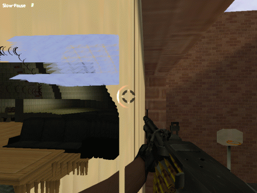 that would not be a bad idea to make them thinner IMO -or drawable *hint* *hint*  Here's what you get elseway when you want to place yourself near the edge of a window. Here's what you get elseway when you want to place yourself near the edge of a window.Now on the corridors. 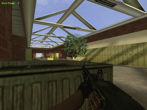 The obstacles provide good coverage, but not exceptional, which is a quality IMO. What is problematic though, is that if you're at one end of the corridor, like here 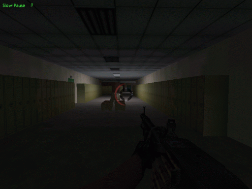 ...and an enemy points his nose at the other end, there's nothing you can do to evade him. You must fight and win, or die. It is appreciable when people are low in health to find ways to escape/flee from a firefight. Take 3DMike's maps: in every corridor, there are rooms on the side with at least 2 doors. When you meet an enemy, and your health is low, nothing is lost yet: you can still manage to evade him. Like here for example : 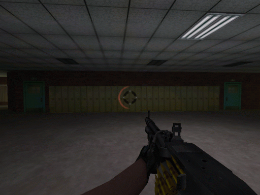 why not make a classroom behind these two doors ? Alright, maybe it's the many tables which scare you for the r_speeds, but you can still make a biology room for example, with long ceramic desks. It's much doable. Ah well, in the end, I'm probably nitpicking because it's a damn enjoyable map already. 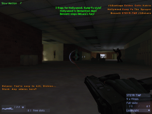 It just makes me uncomfortable to feel such a level of perfection, to feel that you're so close to a masterpiece, damn, I *had* to tell you all this  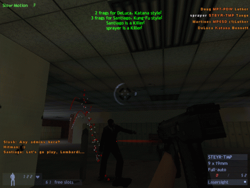 Once finished, ts_normandin will rock everything that's rockable, that's for certain. An AMAZING map. RACC home - Bots-United: beer, babies & bots (especially the latter) "Learn to think by yourself, else others will do it for you." |
|
|

|
Re: What's Carp Got Cooking ? |

|
|
(#75)
|
|
|
Member
Status: Offline
Posts: 182
Join Date: Apr 2004
Location: The Great White North
|
Thank you SO much man !
That's the best help I've gotten yet, by FAR ! Here's what's already happened in the map: -I've added glass top dividers to the library, as well as the book beeper things.  -The courtyard got some benches & structural canopies over the doors.  -The Hall Of Mirrors Effect in the blinds has been dealt with now too. Now, on to what you've mentioned: - Stairwell shading is odd, but not awful. I might just live with it. What was the problem with the railing tex/ lighting ? I can't tell cuz the pic is really dark. -I win the $100.oo !!! All I need to do is slide the ladder up, through a ceiling tile ! I win ! -I absolutely LOVE the idea for the b-ball court ! The sidewalk around it & grass & trees are definately going to be added. Also the door idea is brilliant ! It'll lead through a sports room/lock-up and back into the main hall. I may add a fire escape there as well. -I'll have to revamp the area by the dark pictures, to include a front foyer, with a set of front doors, etc. Also very good inspiration. If that happens, I may be able to open up the doors to the courtyard on that side. -The library may get access through the back corners of the top floor, leading to the second floor hallways. R_speeds are pushing it in there already, so we'll see. Still a great idea though. -R_speeds are the reason I cannot open the door or the windows in there though & also why the blinds cannot be made drawable. -Classrooms may be pushing it, in fact, adding anything more at this point may be pushing it. I'm already using almost every trick I've ever read about to make this map run after each compile !  It's HUGE ! 16Mb already ! Thanks again, man ! If anyone needs me ... I'll probably be mapping.  Cheers ! p.s. Doors ARE ugly ... will change. |
|
|

|
Re: What's Carp Got Cooking ? |

|
|
(#76)
|
|
|
Moderator by day Waypointer by night
Status: Offline
Posts: 1,039
Join Date: Apr 2004
Location: Missouri
|
Wow I haven't even played it yet but from the pictures it looks like a msterpeice!!! Thats what makes a map really great, time and revisions!!! I really like your style carp what are some of your completed maps i would like to get play some?
|
|
|

|
Re: What's Carp Got Cooking ? |

|
|
(#77)
|
|
|
Member
Status: Offline
Posts: 182
Join Date: Apr 2004
Location: The Great White North
|
7 months & counting.
 There are 2 ts maps here for DL. Powerslave & Highwire. I like the sow highwire version much better than the ts one, but ... oh well. (That was then ...) http://users.accesscomm.ca/endo/index.html Much improved, but not yet done, either:  *EDIT* I'm now doing a compile, in which this area leads to a new front entance, via a small, private road. We'll see how/if this works out ... tomorrow. Good freakin' night !  |
|
|

|
Re: What's Carp Got Cooking ? |

|
|
(#78)
|
|
|
Project Leader, Lead Level Designer, Waypointer
Status: Offline
Posts: 337
Join Date: Mar 2004
Location: Denmark
|
Really great improvements Carp. 16 megs? Thats wild!
Nice reply PMB  |
|
|

|
Re: What's Carp Got Cooking ? |

|
|
(#79)
|
|
|
Moderator
Status: Offline
Posts: 860
Join Date: Mar 2004
|
quality !!
PMB = Reality checker  |
|
|

|
Re: What's Carp Got Cooking ? |

|
|
(#80)
|
|
|
Member
Status: Offline
Posts: 182
Join Date: Apr 2004
Location: The Great White North
|
Getting better:
  |
|
|

|
 |
«
Previous Thread
|
Next Thread
»
| Currently Active Users Viewing This Thread: 1 (0 members and 1 guests) | |
|
|
Powered by vBulletin® Version 3.8.2
Copyright ©2000 - 2025, Jelsoft Enterprises Ltd.
vBulletin Skin developed by: vBStyles.com
Copyright ©2000 - 2025, Jelsoft Enterprises Ltd.
vBulletin Skin developed by: vBStyles.com


